Conekta is a tech startup on a mission to enable the digital economy in Mexico. Its online platform offers financial products and services to online stores and large-scale businesses.
CONTEXT
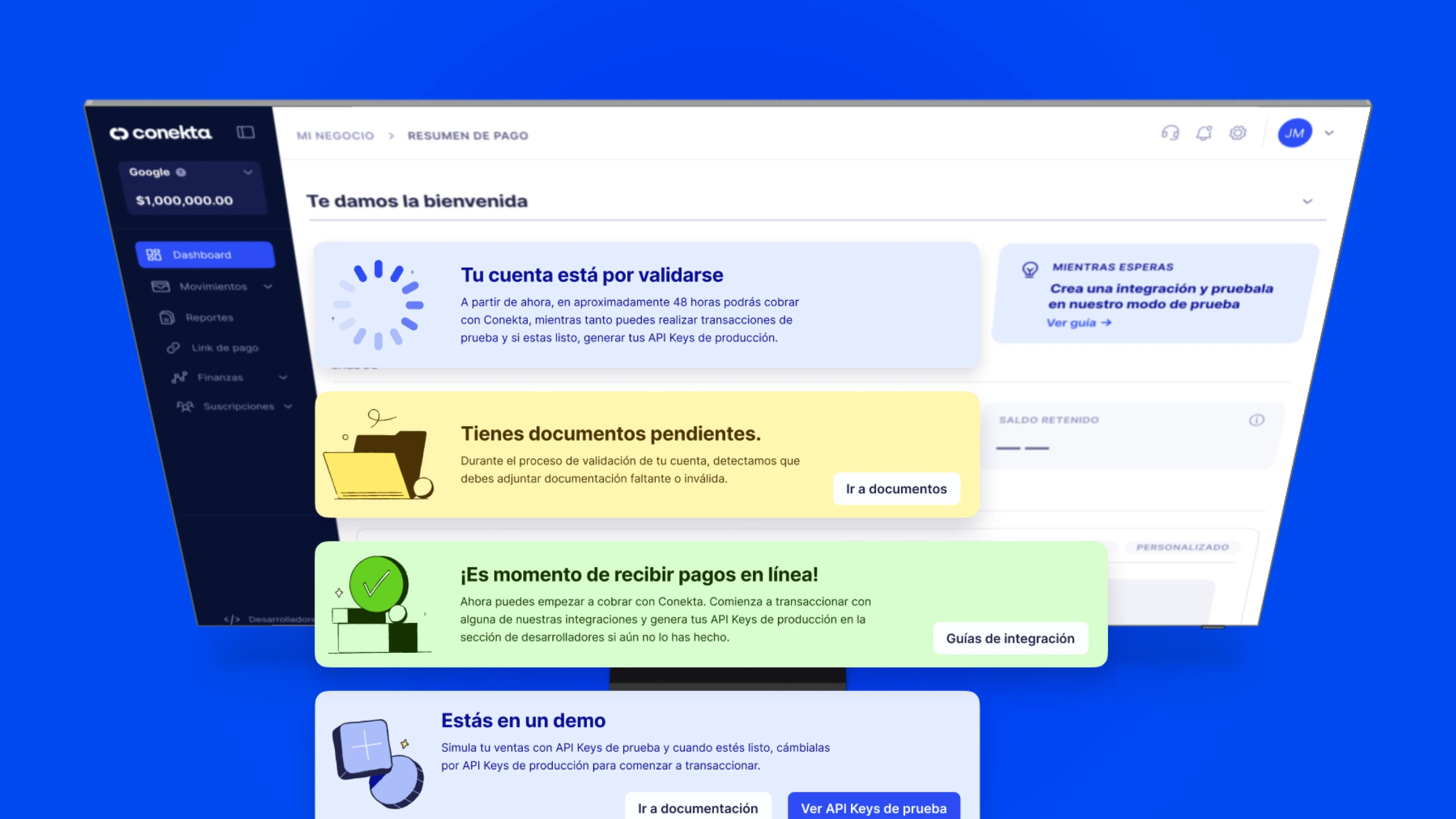
To provide a better onboarding experience for new users, we added announcement banners to our main platform's welcome page. These notifications keep users informed about their progress in real-time and help them understand any requirements they need to meet. This minimizes obstacles and allows us to reach our goal of having all users complete their onboarding process.
PROBLEM
The entire page needs to be visually consistent and updated, especially the banner section, to align with the current design system. It's important for users to receive a clear notification and understand what action to take from the outset.
OUTCOME
Design all risk state banners with their corresponding action banners and information drawers, improve color interaction accuracy, and refine the composition of the entire page to avoid any sense of disorganization.
Designing Risk State Banners
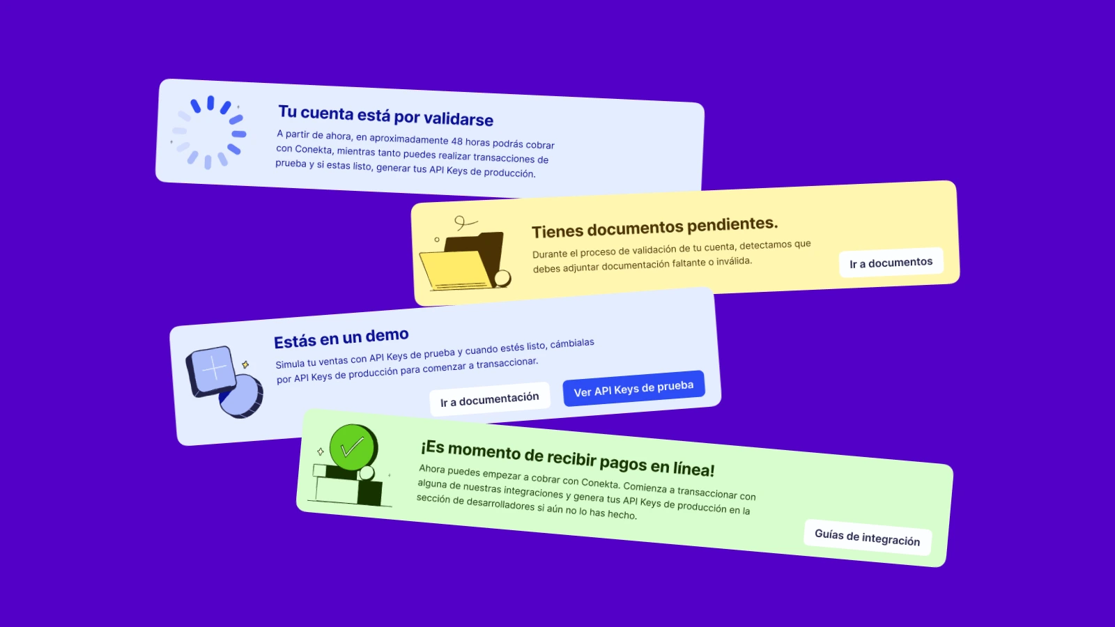
We have categorized user status into four risk states: Pending, Missing Documents, Approved, and Onboarding Omission. By using alert colors, spot icons, and maintaining visual consistency in our design work, we were able to accelerate our time to market and improve the performance of several internal company indicators. It's important to mention that there has been a decrease in support inquiries related to usability, confirming that our platform enhancements have improved the user experience.
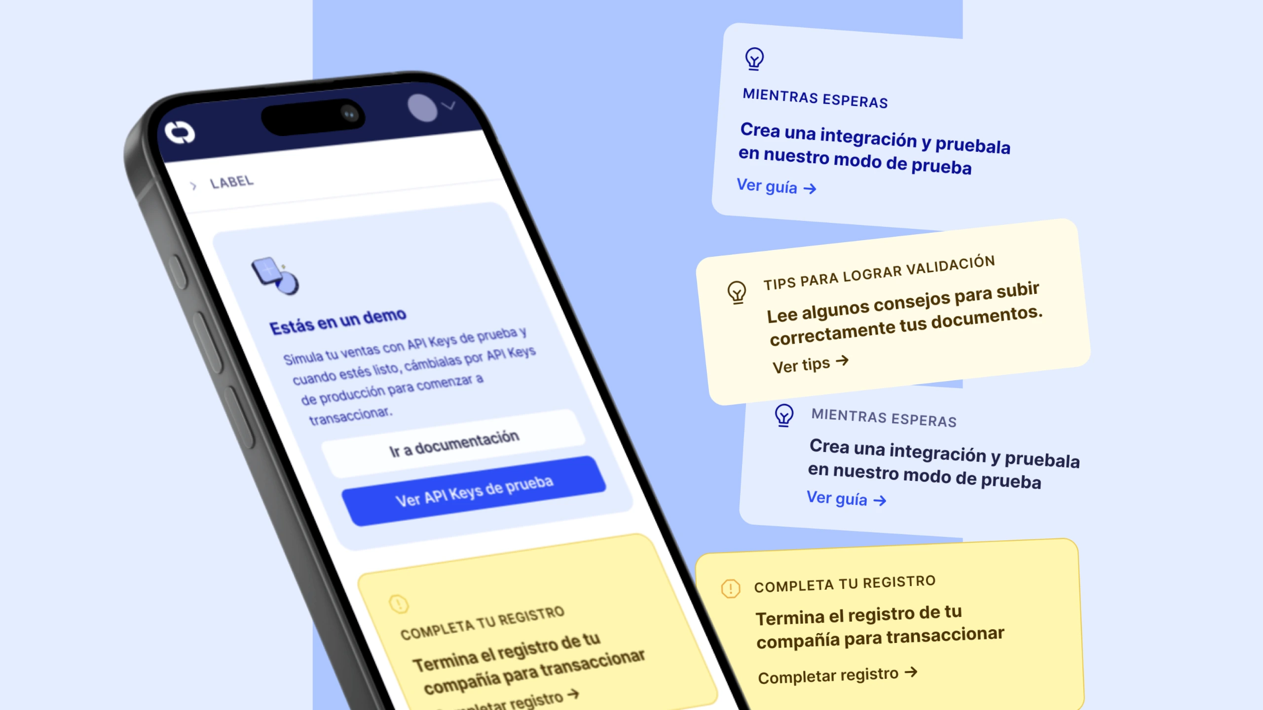
Designing actionables Banners
I created actionable banners to accompany notifications. This ensures that users have the help they need to meet requirements or prompts them to take action when they receive a notification. When users click on the call-to-action (CTA), a drawer slides in with detailed information without redirecting them away from the site.