


I created Liabify’s brand identity ahead of its launch, developing the logo, visual language, and brand book around the idea of a more connected and accessible financial life.
CONTEXT
Liabify’s mission centers on financial inclusion for migrants from emerging economies, helping people build financial stability and support their families. I joined the project before its launch to create the brand’s visual foundation.
PROBLEM
Liabify needed an identity that could introduce a new financial service with both confidence and approachability. The challenge was to express technology, movement, and connection through a distinctive visual language that could work across digital and physical applications.
OUTCOME
I delivered a complete visual identity, including the logo, color palette, graphic language, and brand book. Together, these elements established a consistent foundation for presenting Liabify and developing future brand materials.

A brand built around connection
I developed the identity around movement, continuity, and meaningful connection. These ideas linked Liabify’s technological proposition with its purpose: helping people navigate their finances and build a more stable future. The visual direction combines a structured geometric language with vivid color and people-centered imagery, giving the brand an energetic and approachable character.
Giving the idea a recognizable form
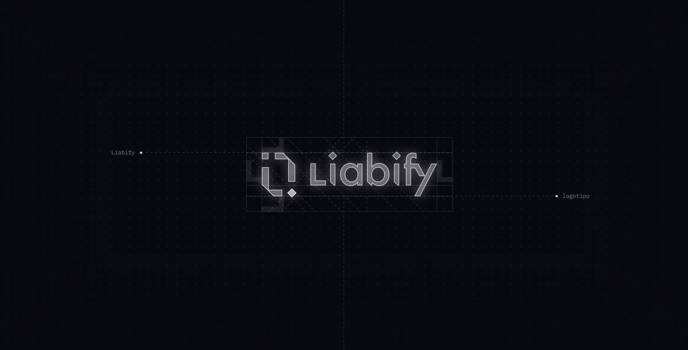
I designed the logo as the starting point for the visual identity. The symbol’s angular segments suggest a continuous path, expressing movement through a compact geometric form. The wordmark carries related details, including angled cuts and diamond-shaped dots. These shared features connect the name and symbol, allowing them to read as parts of the same identity.

Building a visual language beyond the logo
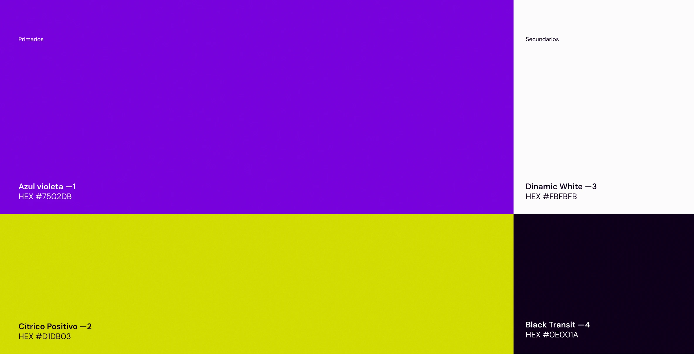
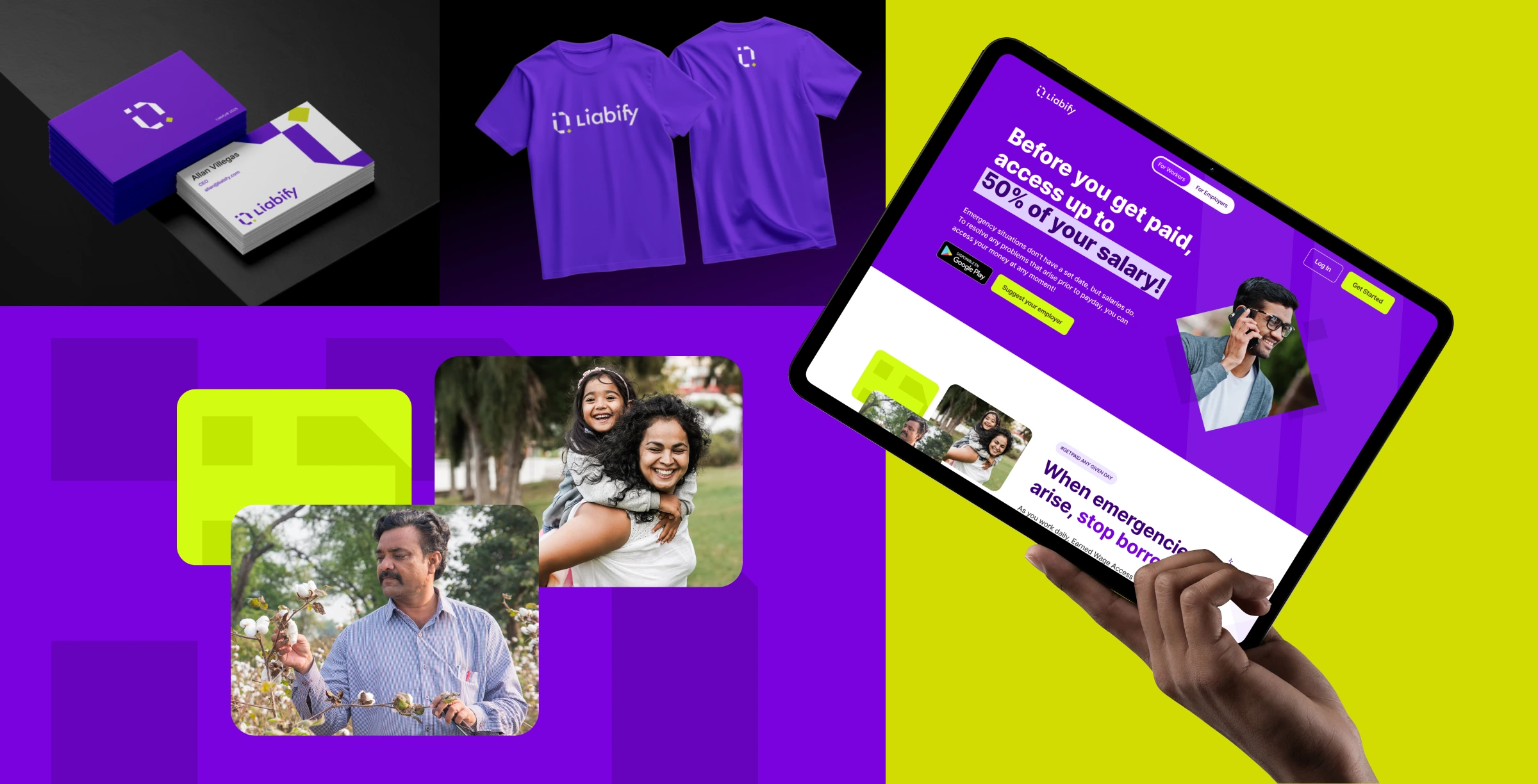
Violet and citrus yellow form the core palette. Their contrast gives the identity a vivid presence, while off-white and a deep, near-black purple provide quieter backgrounds for text and supporting content. Geometric shapes extend the logo’s language into patterns, framing devices, and larger compositions. This creates a visual connection between materials even when the logo is not the main focus.
Keeping people at the center
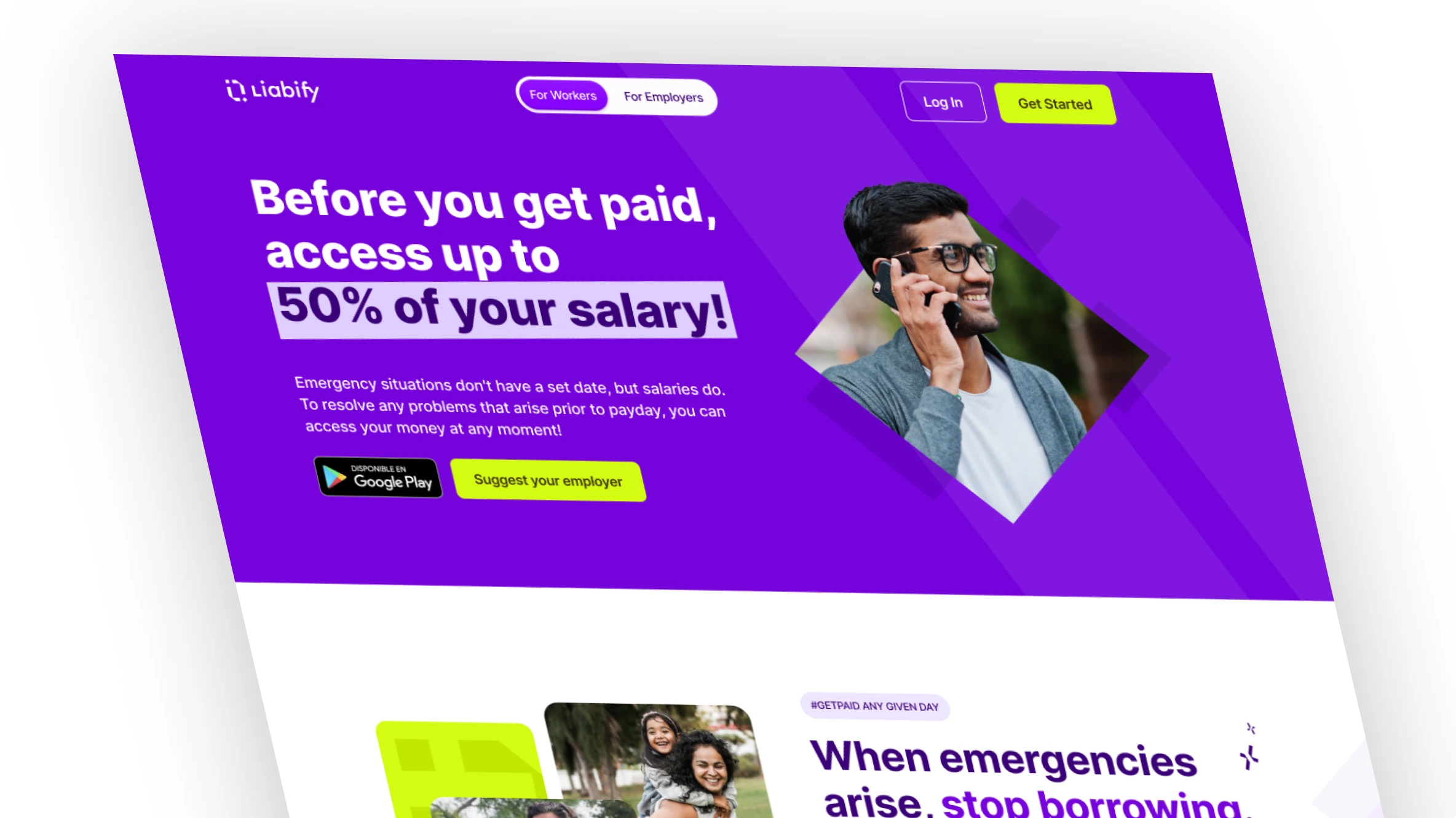
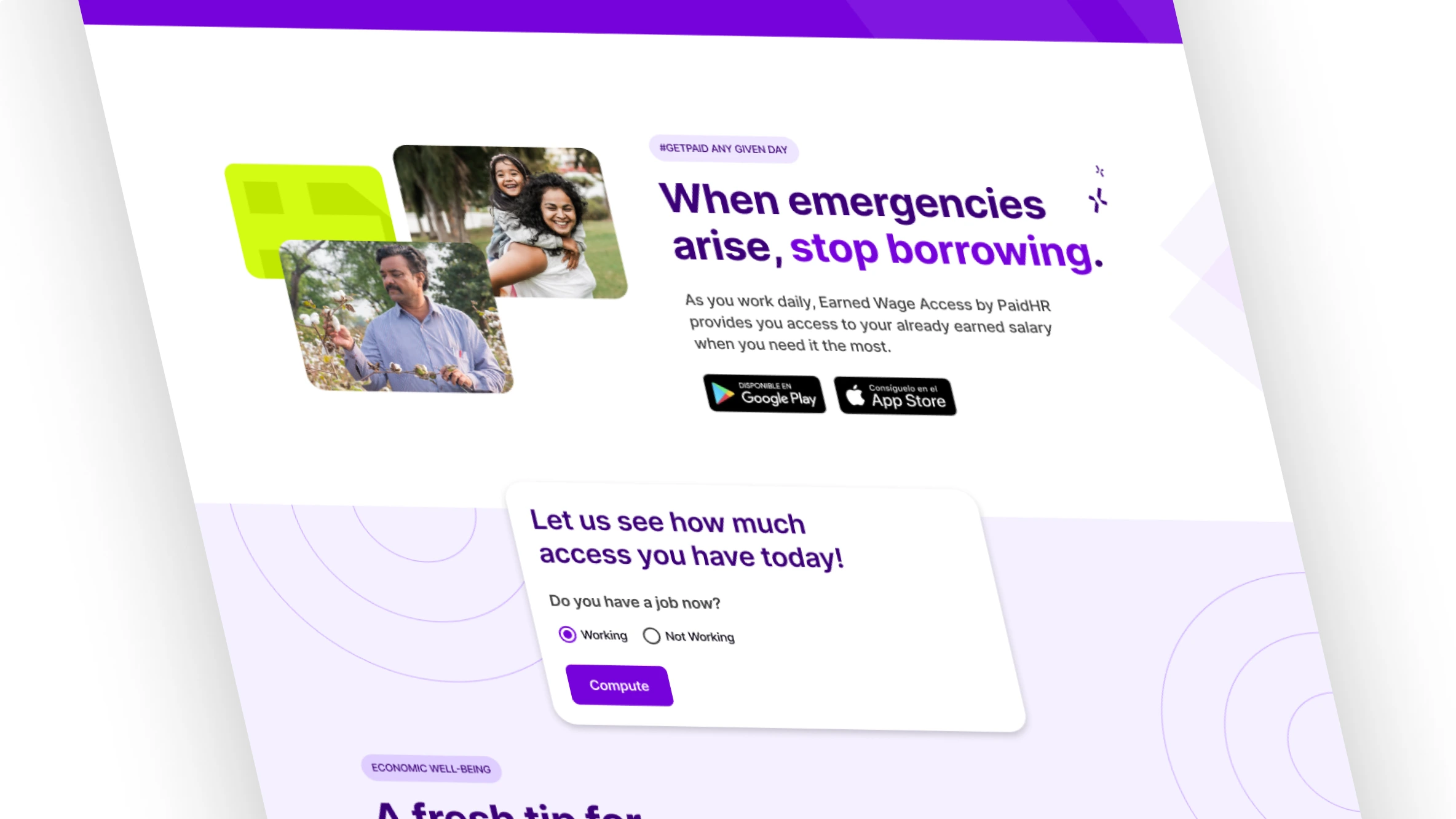
Photography brings an everyday, human dimension to the geometric identity. Images of people and families connect the financial proposition with the lives it is intended to support. Combined with the color palette and graphic elements, this approach gives Liabify a way to communicate technology while keeping its human purpose visible. Here you can see an example of a landing page:
Bringing the identity into use
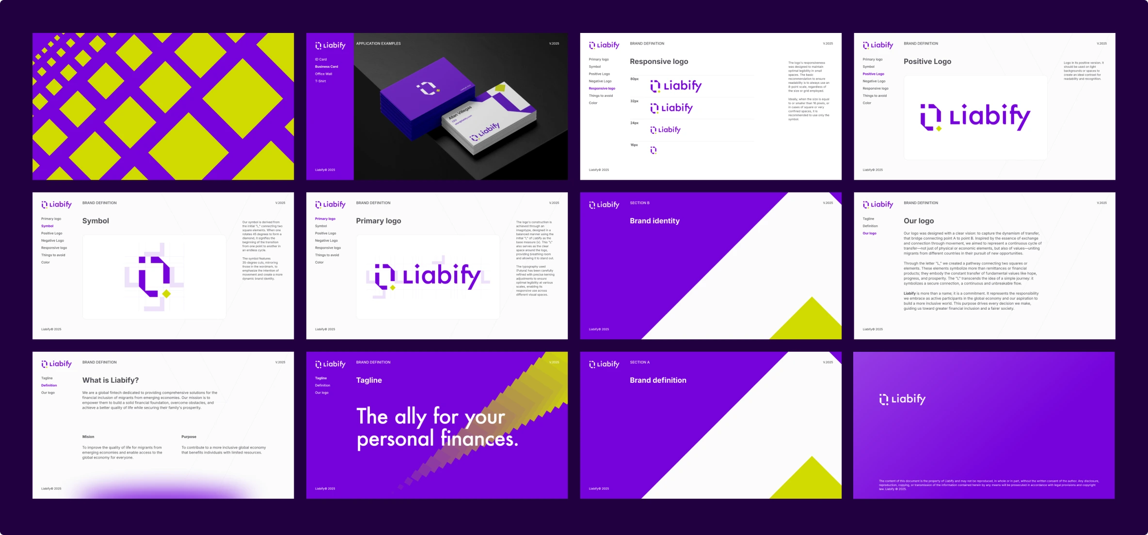
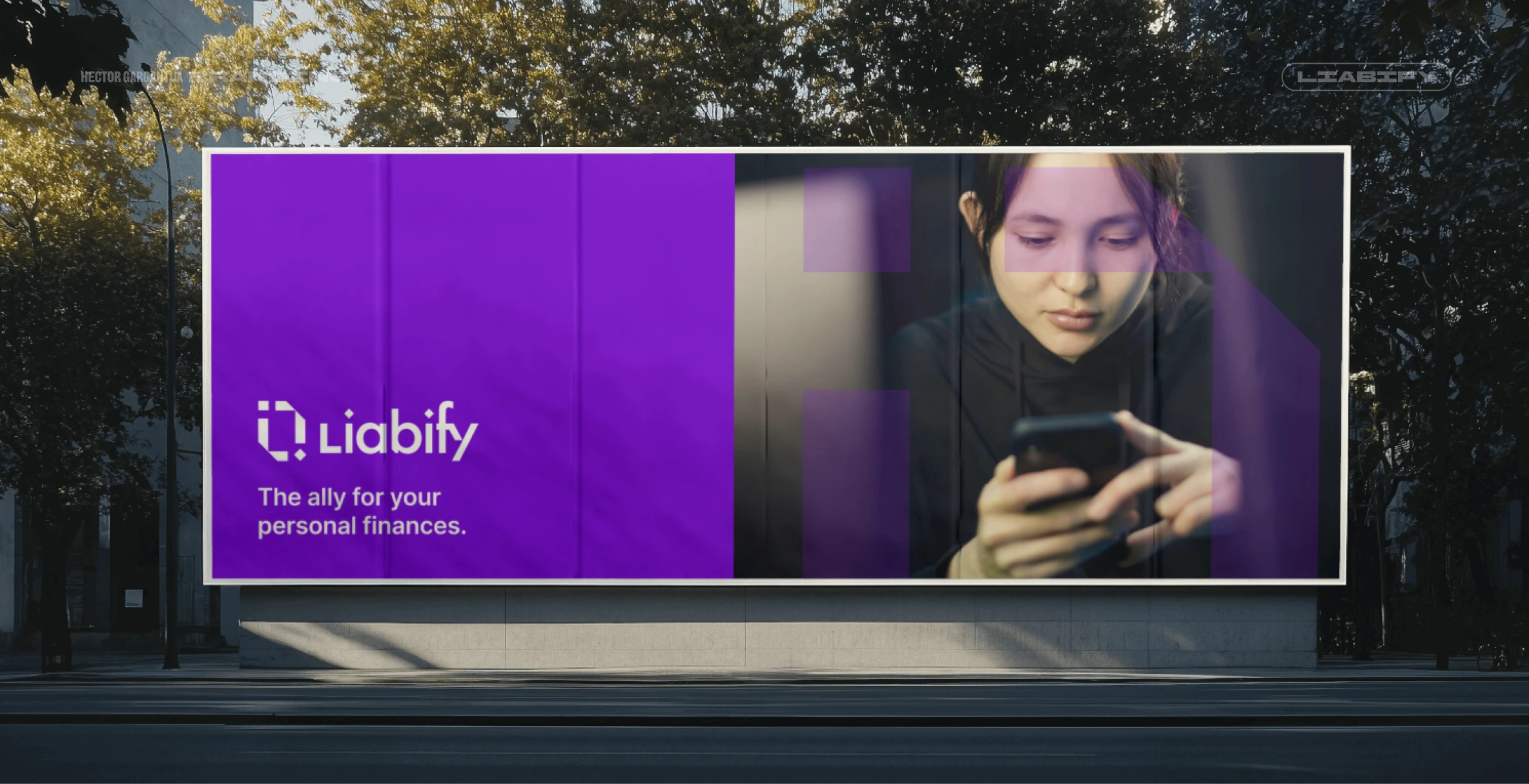
The applications show how the identity translates across business cards, apparel, digital communication, and outdoor advertising. Each format uses a different balance of logo, color, imagery, and graphic elements while maintaining a recognizable visual connection. I also created the brand book to document the identity and provide a reference for its consistent application. This completed the project’s progression from a visual concept to a brand system that could support future materials.
Want to see the brand in action? Visit the website: Liabify.com