


Contributing to Conekta’s brand evolution through visual design and the creation of a brand book that brings its identity and usage guidelines together.
CONTEXT
Conekta connects businesses in Mexico with online payment methods through a single integration. The brand project supported its evolution from a startup into a more mature company, with a visual identity intended to express confidence, simplicity, innovation, and a human approach to technology.
PROBLEM
Supporting this evolution meant developing a cohesive visual language and documenting how it should be used. The identity needed to work across different formats while retaining a recognizable connection to Conekta.
OUTCOME
As part of the team working on Conekta’s brand evolution, I contributed to the development and refinement of its visual identity. I also created the brand book, organizing the brand foundations and visual guidelines into a structured reference for future applications.
Contributing to a cohesive visual language
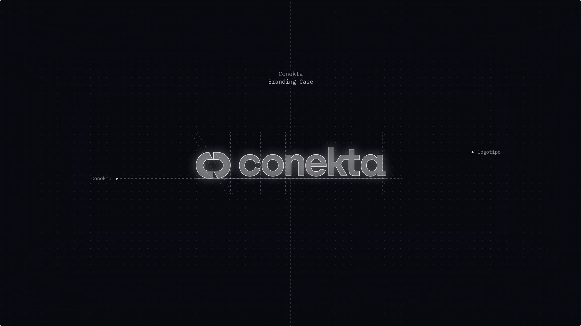
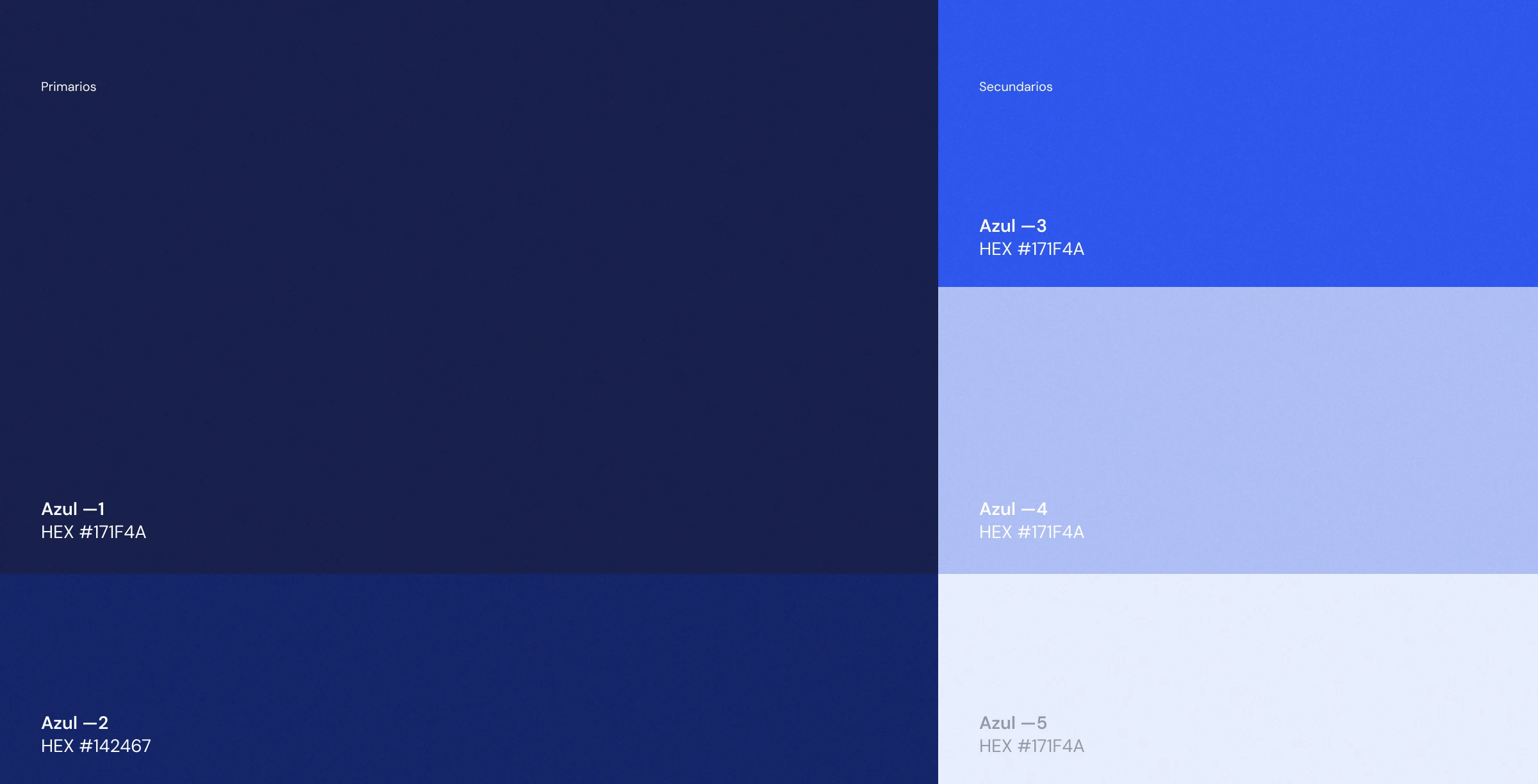
The identity brings together four brand attributes: secure, simple, innovative, and human. Deep blues, brighter accents, geometric forms, and spacious compositions give these qualities a visual expression. My contribution focused on helping develop and reinforce this language as part of the broader brand project. The work connected individual visual elements with a consistent expression of Conekta across different formats.

Bringing the identity together in a brand book
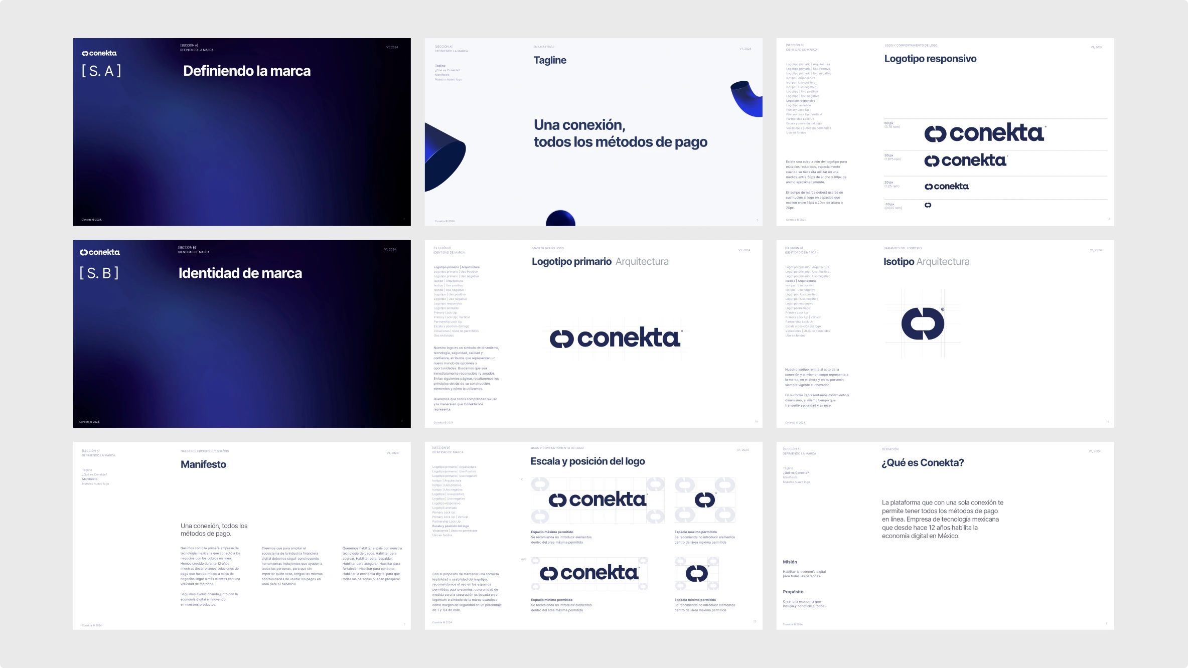
I created the brand book to bring the brand’s foundations and visual guidelines into one organized reference. Its structure moves from defining Conekta—its purpose, message, and brand narrative—to explaining the elements of its visual identity. The editorial design combines clear section openings, consistent page layouts, and visual examples. A recurring navigation column locates each topic within the document, connecting the broader brand story with specific guidance.
Documenting how the identity should be used
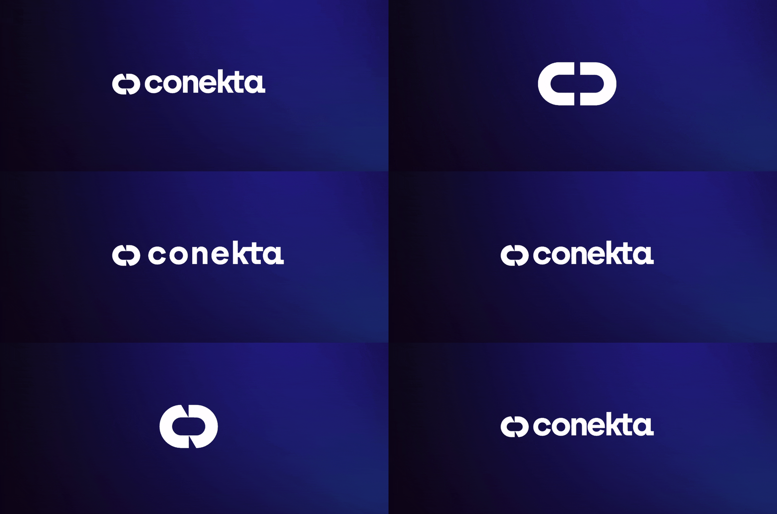
The brand book presents the logo and symbol alongside guidance on their construction, responsive variations, scale, and surrounding space. These examples translate the identity into practical considerations for different layouts and sizes. My work on the document made these guidelines visible through diagrams, comparisons, and concise explanations. The aim was to provide a clear reference for applying the identity consistently as new materials were developed.
The identity across applications
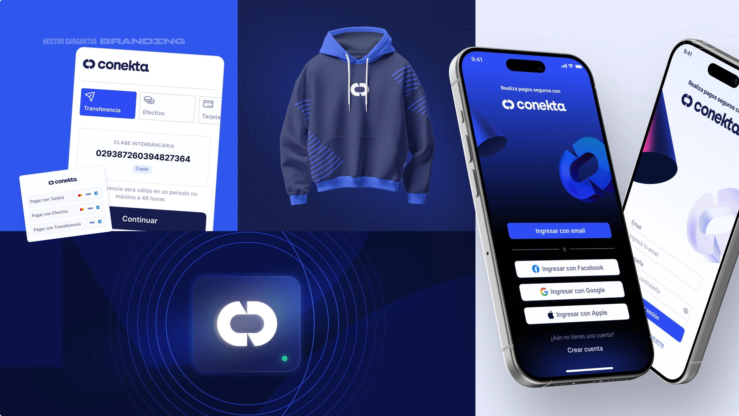
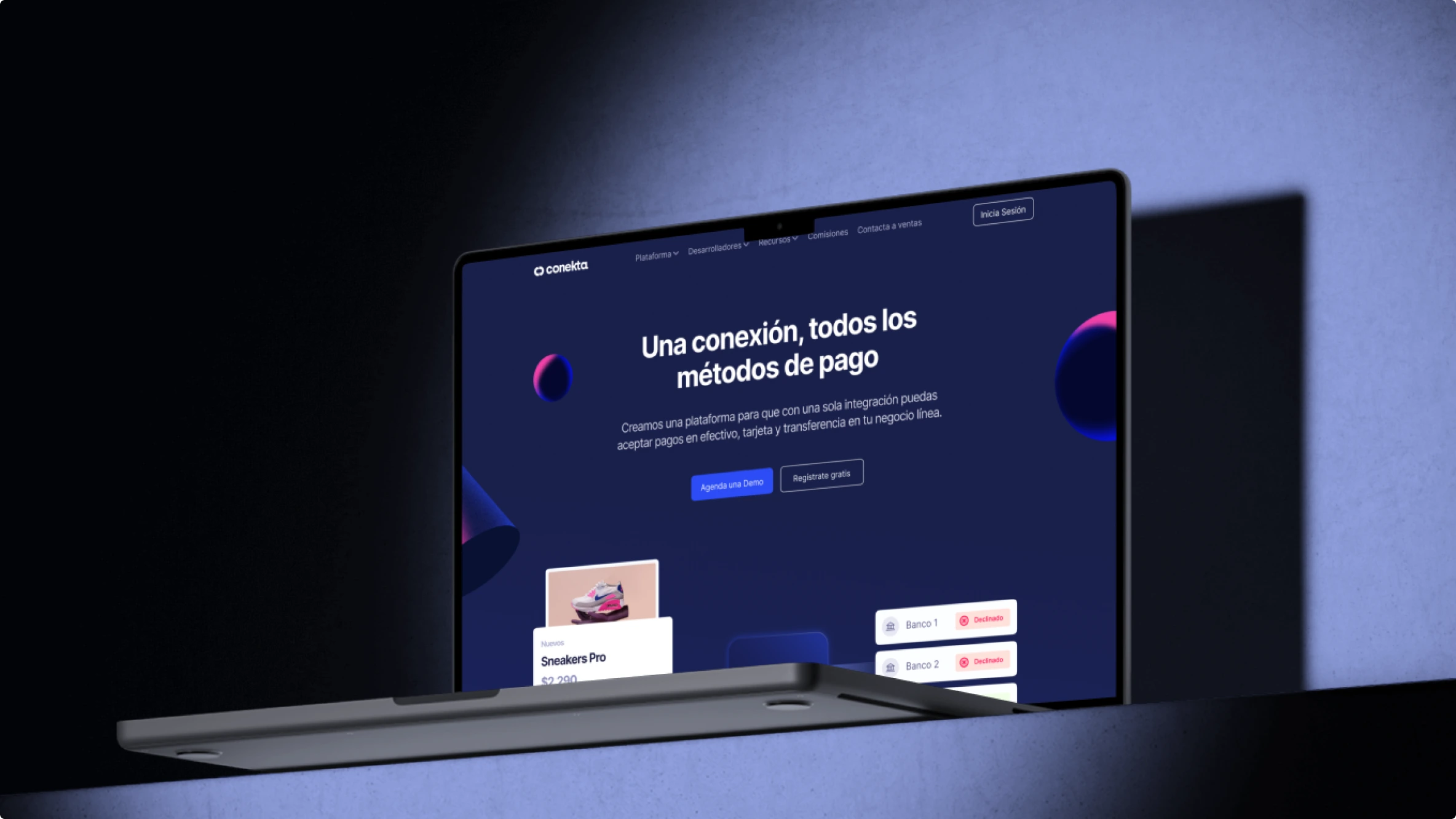
The applications shown here illustrate how Conekta’s visual language extends across digital interfaces, branded merchandise, and web communication. Color, typography, the symbol, and graphic forms create a recognizable connection between these different contexts. Together, these examples place the brand guidelines in context, showing how the identity can remain cohesive while adapting to different formats.
My contribution to the project
My role combined collaborative work on the visual identity with the creation of the brand book. I helped strengthen the brand’s visual expression and brought its foundations and usage guidelines into a structured document. This contribution connected the development of the identity with its ongoing application: a reference designed to help carry the brand into future materials with consistency. Here’s the link to the public brand book in case you’d like to explore it in more detail: Brandbook For Partners
Project credits Brand evolution: collaborative team project. My contribution: visual identity development and refinement, brand book design, and visual guideline documentation.